SGA
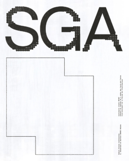
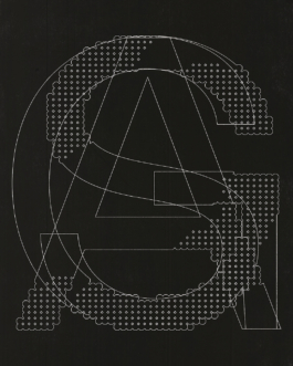
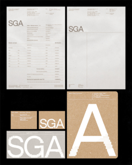
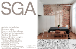
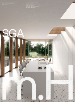
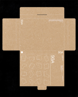
For the creation of the new visual identity for Samuel Gloess Architectes (SGA), we were entrusted with the development of a complete branding system, from strategy to execution. The project is rooted in SGA’s design methodology, which focuses on revealing the intrinsic materials of the built environment and rethinking circulation as a structuring principle. At the core of the identity lies an extensive typographic work directly inspired by this approach. Letterforms are conceived as constructed objects: shapes are stripped back to their structural essence, exposing tensions, weights, and alignments in the same way SGA reveals the logic of architecture. Cuts, contrasts, and proportions echo the articulation of materials and the flow of movement through space. The resulting system is sober, precise, and enduring. Through a typographic language that privileges structure over decoration, the identity reflects SGA’s architectural culture and positions the studio as a practice where method, clarity, and spatial intelligence define both form and meaning.
Mission: Visual Identity
Client: SGA
Year: 2024


SGA
Mission: Visual Identity
Client: SGA
Year: 2024